Indoor Climate Visualization
Background
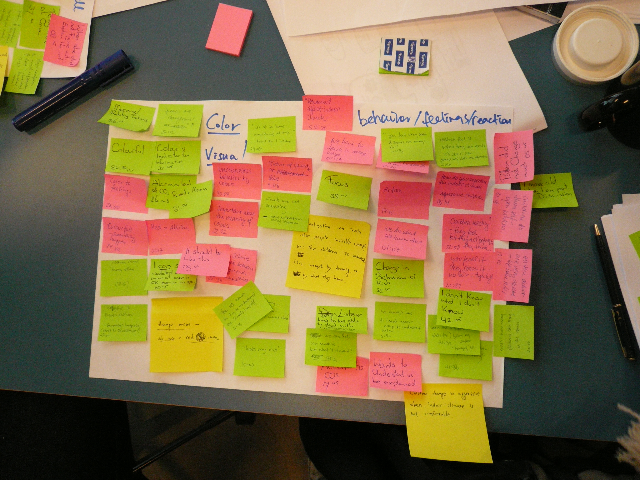
The goal of this project was to explore people’s experience of indoor climate. Also, we wanted to facilitate a conversation between experts and non-experts to discover design opportunities (interviews and workshops). This is a part of a larger on-going indoor climate research project at the SPIRE research center.
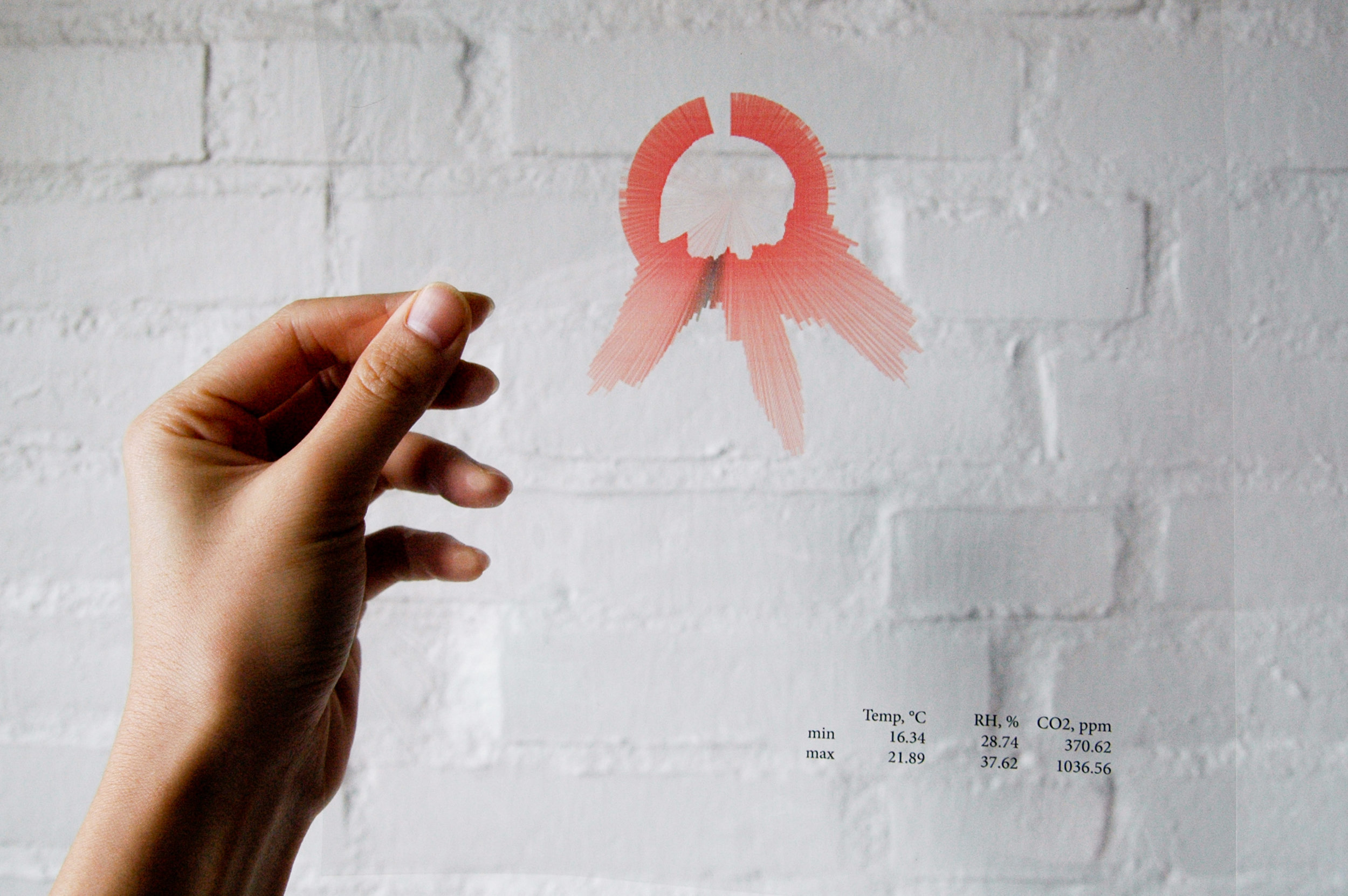
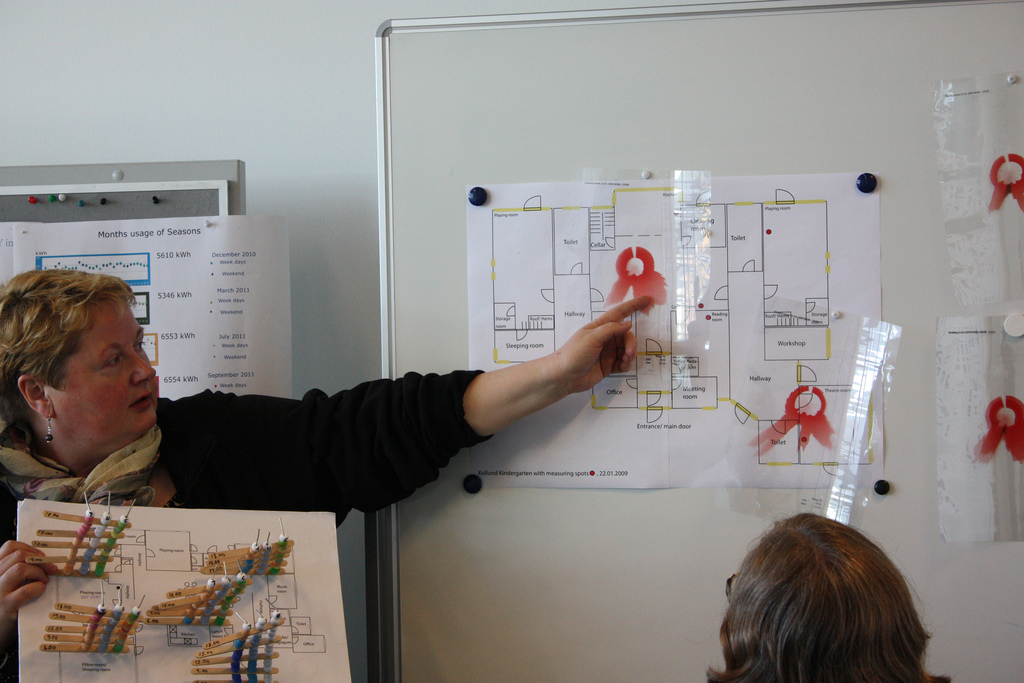
We used a set of indoor climate data measured with sensors during a 72-hour period. The three parameters are temperature, humidity, and CO2 concentration gathered from 5 different classrooms in a kindergarten.
Approach
To begin, my project partner and I started with a few questions:
Why is visualization necessary/effective to explore user experience?
What should we visualize and in what time scale so that the information becomes relevant?
How can people acquire a clearer perception of indoor climate, a perception marked by reflection, personal involvement, and interest?
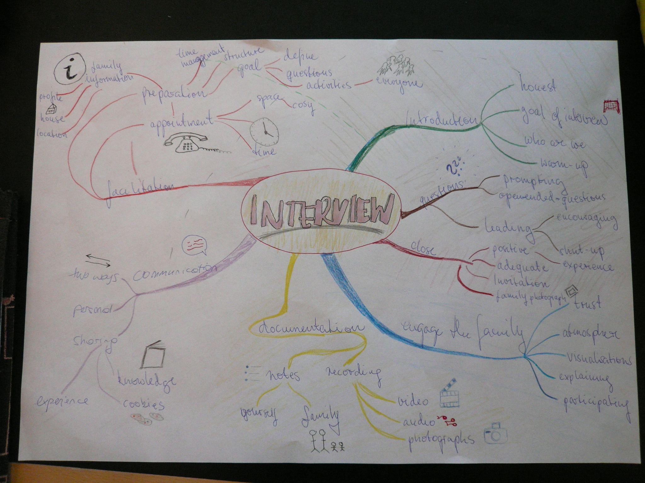
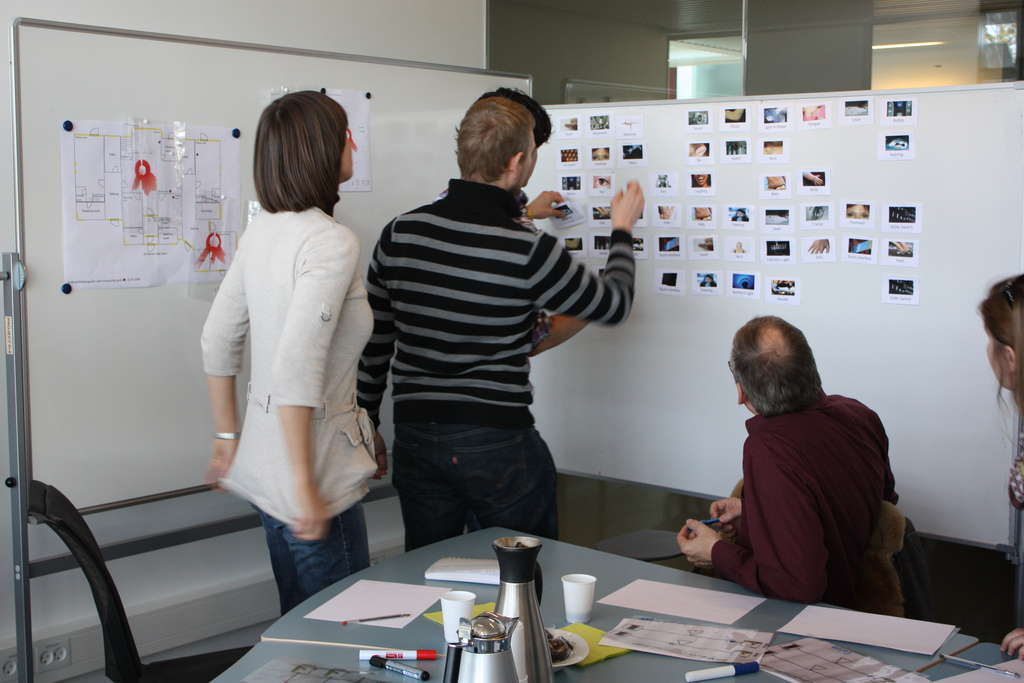
In search of answers, we participated in the Kolding School DesignCamp 2011. During the workshop, we had the chance to explore our questions with design psychologists and researchers.
Result
Using Processing, I visualized a data set of the indoor climate of 5 rooms in a kindergarten over a 24-hour period. The diagram reads like a normal clock, where the 12 o’clock position corresponds to the start of a day. The color indicates the temperature, the outer ring represents the CO2 level, and inner ring shows the humidity level.
These diagrams were printed on transparencies so that the viewer can stack the diagrams to compare the data between rooms. We have also included a kindergarten floor plan, so that the viewer can associate differences between classrooms with the distance or layout of the space.
Using this visualization as a probe for an interview with a teacher at the kindergarten, we were able to better understand the teachers’ and children’s perceptions of indoor climate and the effects on their behavior.